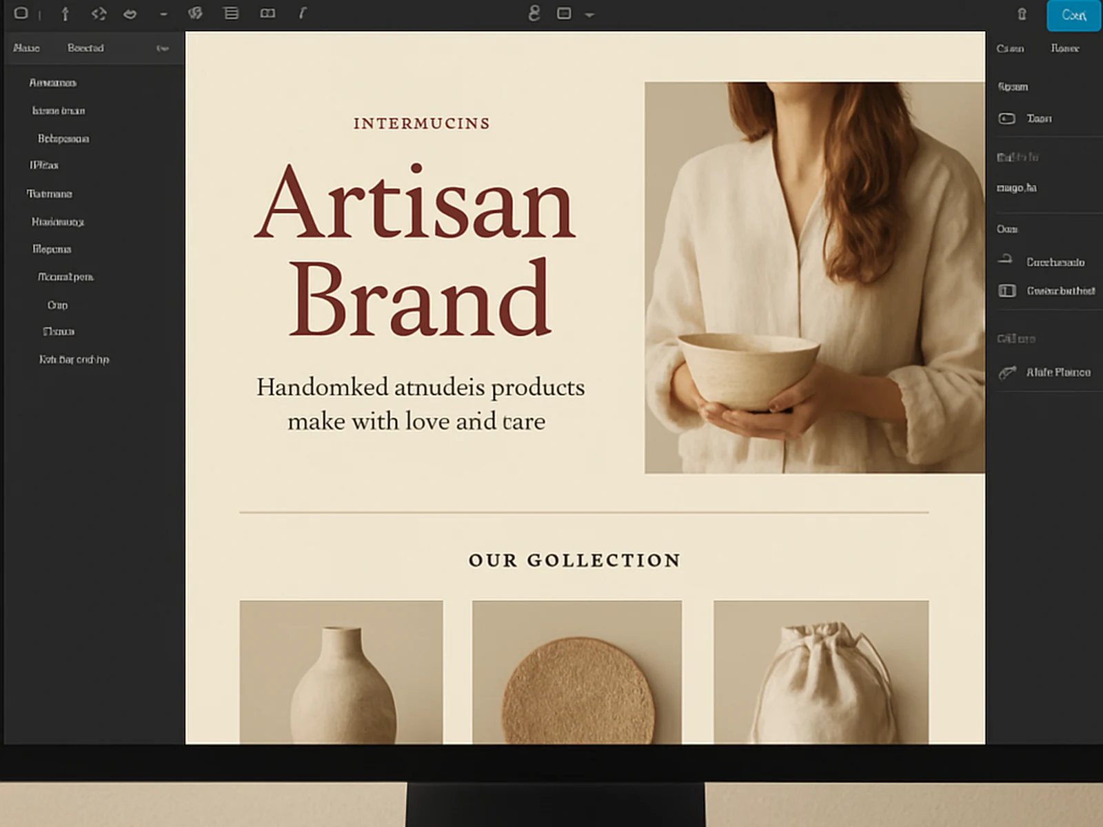
There is a version of a website where you pick a template, swap in your logo, and move on. That version is fine for a lot of businesses. It is not what we do.
Editorial website design starts from a different place. Before we design anything, we map what the site needs to communicate, in what order, to which type of visitor, and with what emotional register. A site that feels calm and considered communicates something completely different from one that feels fast and urgent -- and both of those might be right, depending on the brand.
Our process starts with a content architecture session. What pages does the site need? What does each page need to accomplish? What content exists and what needs to be written? We build the structure before we build the design.
From there, we design in Figma. We start with typography because it drives layout more than color or imagery does. We spend meaningful time on it. The right type choice, combined with the right spacing and hierarchy, is what separates websites that feel handcrafted from websites that feel generated.
Photography direction is part of our process. We do not just drop images in; we think about how imagery and design work together and provide a brief for any photography shoots that are part of the project.
The result is a website that feels like the brand -- not like a design trend, not like an industry template, and not like a tool we used.
- Content architecture and page mapping
- High-fidelity Figma design (desktop and mobile simultaneously)
- Typography system and spacing development
- Photography direction brief
- CMS build in Webflow, WordPress, or the platform that fits
- SEO structure and meta configuration
- Performance optimization
- CMS training at handoff
- 30-day post-launch support