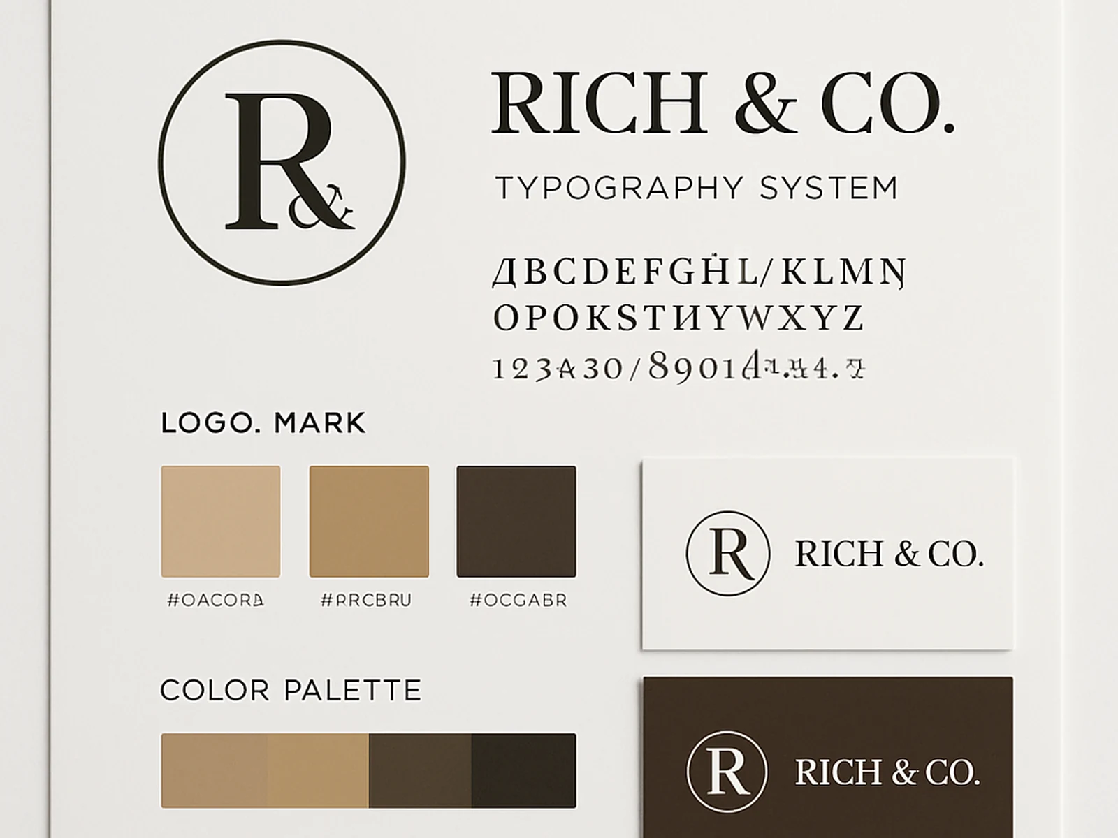
A logo is one part of a brand. The part that most people start and stop at. What actually gives a brand visual recognition is a system -- a consistent set of decisions about color, typeface, scale, and the relationship between graphic elements that can be applied across completely different contexts and still feel like the same thing.
We design brand identities that work as systems, not just as a logo file. The deliverable is not a single PNG; it is a documented visual language that your team, your printer, your web developer, and any future designer can apply correctly.
Our brand identity work always starts with research: your industry, your competitors, the audience you want to attract, and the position you want to occupy. We want to understand where you are trying to sit in people's minds before we make a single visual decision.
From there, we develop multiple strategic directions. Not random variations of the same thing -- genuinely different directions that represent different ways of solving the positioning problem. You choose a direction to develop, and we build it out into a complete system.
Everything is delivered in formats that actually work: vector files, web-optimized exports, color specifications in multiple color systems, and a brand guidelines document that explains how to use everything.
- Brand positioning and strategy session
- Competitive landscape review
- Logo design (primary, secondary, and mark)
- Typography system (heading and body typefaces)
- Color palette (primary, secondary, and neutral)
- Brand guidelines document
- Business card design
- Social profile assets
- Web-ready and print-ready file exports